My group and I had come up with some ideas for our potential magazine front cover. I had suggested that we use Total Film as our magazine as I feel that it interacts with the readers more with its sense of humour and layouts, unlike Empire, which is just strictly about films. We had analysed several Total Film magazines and had noticed many conventions that we will be including.


The 3 magazine covers above all have similar conventions.
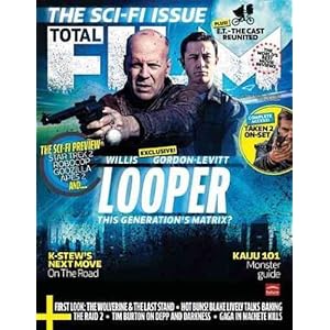
- The mast head font remains the same however, the way it is designed is made to suit the genre of the magazine, for example, with "Salt" featuring Angelina Jolie, the 'FILM' is edited into a glass like look with cracks in it, from perhaps a gunshot to emphasis that it is an action movie
- Above Total Film, there is always a quote backing up about how good this magazine is or why it is special and why you should buy it.
- The barcode is very unique and is not just a simple white block, but has a logo on it, too.
- On the bottom left corner, there is a + sign which tells us more of what is inside the magazine draw attention to the reader that there are more interesting articles inside.
- The image of the featured person/people is taken at a medium/medium-close shot.
- Uses capitals and lower cases appropriately to emphasis the more important things, unlike 'Empire' where most things are capitalised.
No comments:
Post a Comment