Thursday, 7 March 2013
How did you use new media technologies in the construction and research, planning and evaluation stages?
New Media Technologies Part 1 by karwinlam on GoAnimate
Animated Presentations - Powered by GoAnimate. New Media Technologies PART 2 by karwinlam on GoAnimate
Animation Software - Powered by GoAnimate. New Media Technologies PART 3 by karwinlam on GoAnimate
Animated Presentations - Powered by GoAnimate.
Animated Presentations - Powered by GoAnimate. New Media Technologies PART 2 by karwinlam on GoAnimate
Animation Software - Powered by GoAnimate. New Media Technologies PART 3 by karwinlam on GoAnimate
Animated Presentations - Powered by GoAnimate.
Monday, 4 March 2013


Sunday, 3 February 2013
Front Cover: Positioning
Here is an update on the Front Cover magazine that my group and I have been working on. I believe we have added many conventions into the magazine and will be adding much more. We have asked for some feedback from teachers and students about positioning our text and where the final girl should be placed. My original front cover was the top one and I had tried to move her to the side to see how it would work. Some students and teachers like the side on effect and some prefer it in the middle. Personally, I prefer it in the middle however, not everyone in my group agrees. After long discussion about what will benefit us more, we had decided we will be sticking to keeping it in the middle as this is a common convention used in most magazines. The text will be wrapped around the final girl but not covering her face.


In certain aspects, the side shot effect is effective however, I feel that have text on just one side of a magazine is not good enough for anyone's standard.
Poster: Sci-Fi Effect
This is my most recent Poster which includes many of the conventions that my group and I originally came up with in our flat plan and we have included more things for a better and more professional look.
I have included a Sci-Fi high definition look which works well as my trailer includes a lot of Sci-Fi filtered scenes to create a 'being watched' or 'recorded' look. The poster is done as if it is being seen at night time from a camera or a CCTV. I feel that using this really connects with the audience as the final girl is staring directly at the camera (audience) which shows a 'help me' signal being given off.
I have included the '18' logo on the bottom left of the poster to show that the film is an 18 rated film by the BBFC which stands for British Board of Film Classification. This is done as it shows professionalism within my poster and what sort of film it is.
Also, I have added a 'Lionsgate' sponsor on the bottom right which is seen on many films by Lionsgate. I did this because not only is it professional but, Lionsgate is recognised internationally and allows my poster to seem like a big upcoming film that will have its own premieres and interviews and would be all over tv adverts and news.


However, this is not yet the final poster that my group and I have come up with. I believe that there is much more to be added.
Poster filtering and adjustment of colour
I have been working on the poster for a few days and I have been adjusting different colours and filters to the original image which is a picture of the final girl's eye. Below is the picture.

I chose to use this picture as I believe it shows fear. I had discussed this with my group and we all agree that once it had been manipulated on Photoshop, it would look even scarier and relate to the film.
Below is a quick edited print screen of it, straight away we see a definite darkness to it, with Slenderman's sign in the middle of her eye and a darker adjustment of colour. As you can see, there are several layers on there which create this effect. This includes changing the brightness, contrast, hue, saturation and colour.
Her pupil has also been photoshopped to seem as if it is dilated this was noted by Alfred Hitchcock in the film 'Psycho' where a critic said the shower scene was not real enough as the dead girls eyes were not dilated. I feel that by doing this, I can match up to Hitchcock's standard and be noted for because of the detail that I include.

The image below was an edit that I did not like, I feel that this edit has made the final girl into someone else of a different ethnic background.

Thursday, 31 January 2013
Airbrushing
The top poster has been airbrushed to get rid of any unwanted attention on the picture of the final girl's eye. The eyebrow had tiny little hairs that we felt got in the way of the poster so that was removed by using the airbrush tool. We also felt that dots of mascara spread around her eye was taking away the attention, too.
I feel that including small details like this is really effective as I believe that small things could make a big change to our final outcome.


Monday, 28 January 2013
Front Cover with Static

Front Cover Editing

The front cover above was done by Mahek and Haffsa Whilst Cleo and I was working on the trailer editing. The conventions have been met and has started to look like an amateur magazine. An interesting thing I like about this is the film reel at the bottom to show upcoming movies and also a link in with the 'PLUS' and the movies below it. I had put in some input with the 'NO' spread all over effect and the Slenderman logo in the middle below the final girl. I like them, however, I would take away some 'NO's as I think it is too much.
Below is a another front cover magazine Mahek and I had refined through the old one above. As you can see there are drastic improvements and changes that have been made.

As you can see, the film reel has been changed from white to black for a more realistic look and the link between the 'PLUS' and the reel has more of a connection. A better barcode has been added as the previous one was blurry. An updated picture of the final girl has been put up as we feel that the old one was poor and cut outs were bad as this reduces the quality of the magazine.

In this final print screen, is the most up to date one that I have done. It includes a colour change in the Slenderman logo to make it easier for the audience to guess what film it is, if they do not know. Fonts have been changed, but not all of them yet. I will be working into this.
Saturday, 26 January 2013
Front Cover, Poster and Trailer editing.
My group and I have all been busy with our individual tasks, Cleo and I have been editing the film trailer and Mahek has been creating the front cover, with help from me, too. As a director of the trailer, I feel that I need to pay more attention to the trailer first before the front cover. However, key ideas have been inputted from the trailer to the magazine.
The poster has not yet been started. This is because Haffsa has been ill and I have taken on the responsibility to do this task however, we have not captured the perfect image for our poster.
Our film trailer is getting along well, we are near completion but we have so much more to add and make it as scary as possible. We have an updated trailer that was edited by Cleo and I with both our ideas involved and a lot of feedback had been given to us and we took it as constructive criticism. Through this, our trailer has become more Blair Witch Project style which has the recorded sense to it. I believe that our trailer is amongst one of the best as anyone that has watched it said they were scared of it, due to the diegetic screaming and music that we have included. Further details and improvements will be made to make our trailer up to an A* standard.
Friday, 25 January 2013
Front Cover Editing
This is not the final picture for my front cover however, I have used a draft image to do some tests. With this, I have placed the body of slenderman into the Final Girl's eyes to show that he is near and there is a connection between them. I think that by doing this, the audience will appreciate the little details included into the magazine. And for the ones who do not notice, it will just seem like an amazing front cover to them.
I had asked for people's opinions and some people could tell that her eyes had been photoshopped in the first image so I turned down the opacity and blended in Slenderman's body with her eyes more. In the second picture he is less visible and the picture looks better and unedited.


Monday, 21 January 2013
Slenderman Game


These screen shots were taken from my iPhone and had inspired me with more ideas for my poster, trailer and front cover. The Slenderman in these screenshots have extra arms or tentacles coming out of him and they gradually get longer as he tries to attack you. His legs are longer but the body is the same. I think that for our poster things can be edited to make him seem more scarier.
The music in the game is also very tense. It gives off an abandoned and alone feel as if you are all alone and no-one is there to help you. I think this is effective to use in our trailer as the music will emphasise the abandoned feel and create a scarier atmosphere for the audience.
Poster Ideas 2
The two images below are pen drawn ideas for our possible title for our trailer Slenderman, it is a test to see which would be better, Photoshop or Pen.
As you can see, I have done one in lower case and one in upper case to have a variation to chose from. I think that having this will allow our group to decide easier which one we would want.
In my opinion, I prefer the one created on photoshop as it is much more flexible and can be changed at any time if something does not look right.
What do you think? Leave a comment below.


Poster Ideas


I have created slenderman titles for our poster and the idea was to create the logo in such a way that it could seem like it was part of the poster itself as we were thinking of using a forest as the background. I have distorted a font on Photoshop to make the words more twig like and we also had an idea of maybe making slenderman raise his long arms into the text so it looks like it is part of him.
Further details will be added.
Slenderman alterations.
Slenderman can be interpreted in many different ways by many different people and things may differ from text and images. At first, we was really strict about following all knowledge about Slenderman, how he works, how he moves and what he does.
However, after a discussion with my group and personal research, I had come to the conclusion that many films that were inspired by urban legends or books have alterations to make the film more interesting and have a variation. So I had decided that we do not have to fully follow the conventions of Slenderman and that we could add in things of our own into him and create a scarier and fearful Slenderman for our trailer.
However, after a discussion with my group and personal research, I had come to the conclusion that many films that were inspired by urban legends or books have alterations to make the film more interesting and have a variation. So I had decided that we do not have to fully follow the conventions of Slenderman and that we could add in things of our own into him and create a scarier and fearful Slenderman for our trailer.
Saturday, 19 January 2013
Audience Feedback.
Once we had done our rough cut trailers, we had shown our clips to two sixth form students and as you can see, they really enjoyed it and was scared. I had shown them my own trailer and the things they said I should improve on are the things I have not yet finished yet, so overall I think it was good feedback. They also really liked the music and especially the heartbeat.
The other half of the video is response from my media class. As media students, they are more aware of camera shots and how things are taken, of course their feedback will be more in depth. They all really liked the trailer and thought that improvements should be made, just like the other 2 students. However, they really focused on fonts and filters of the clip. They had all noticed that I had unfinished filters and gave me suggestions on how to make things to more real and cut out certain clips that were too long or repetitive.
So far, I think my group and I have made a great start to the trailer and we will be improving it daily and showing updates on what we have improved.
Rough Cut 1. A2 Media Studies
This is the rough cut that I had made for my group which includes a lot more scenes of the teenagers breaking into houses and wondering around and running. My group liked it and we all agreed that if this were to be merged with Cleo's rough cut, our final trailer will be outstanding. I think that so far, my trailer is good. I especially like the beginning where lionsgate logo is shown and fades to woods straight away. However, I had learnt that the green screen 'R' rated part would need to be changed as it is american. My group and I have already been searching for an alternative or perhaps, designing our own. Much more needs to be edited at the end of this clip as I have put filters on the scenes at the start. A reason why the end is still unedited is because the filters where just a test to see which was more effective, filter or no filter. Turns out to be filtered. The filter I had used was the 'Sci-Fi' filter as long as changing the brightness, saturation and contrast of the picture.
Rough cut 1 of 2
Here is a rough cut for our group that Cleo had came up with. We all think it is really good for a rough cut and will be worked on. Although we like it, there is still much more improvement to be made and will be merged in with the rough cut that I had come up with, too.
In this one, a lot of forest scenes are used which I think is really effective as Slenderman is located within the deep dark forests.
Tuesday, 15 January 2013
Flat Plans
After analysing, my group and I put the ideas we had onto paper. Drawn by Mahek, we had a clearer understanding of what we wanted our magazine to look like and we all agreed on how it should look like and what should be included.

This was our first initial flat plan, with no conventions apart from the mast head and the image. This was just so that we could have a template of what we want and add or edit conventions that we would include later on.

This is one of our prototype flat plans and we have included many conventions that we want within our magazine. We have included things such as: the unique barcode, puffs, plus signs for extras, bleed outs, pull quotes, title of the film and a freebie section. We had included two freebie sections as we still need to decided which one we would want to use. One is located on the top of the magazine and the other is a circular shape locate just above the middle-left of the magazine.
I plan to put this onto photoshop and start on my magazine as soon as possible making the magazine as accurate as possible to our final flat plan.
Starting on our magazine front cover
My group and I had come up with some ideas for our potential magazine front cover. I had suggested that we use Total Film as our magazine as I feel that it interacts with the readers more with its sense of humour and layouts, unlike Empire, which is just strictly about films. We had analysed several Total Film magazines and had noticed many conventions that we will be including.
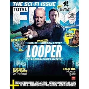


The 3 magazine covers above all have similar conventions.
- The mast head font remains the same however, the way it is designed is made to suit the genre of the magazine, for example, with "Salt" featuring Angelina Jolie, the 'FILM' is edited into a glass like look with cracks in it, from perhaps a gunshot to emphasis that it is an action movie
- Above Total Film, there is always a quote backing up about how good this magazine is or why it is special and why you should buy it.
- The barcode is very unique and is not just a simple white block, but has a logo on it, too.
- On the bottom left corner, there is a + sign which tells us more of what is inside the magazine draw attention to the reader that there are more interesting articles inside.
- The image of the featured person/people is taken at a medium/medium-close shot.
- Uses capitals and lower cases appropriately to emphasis the more important things, unlike 'Empire' where most things are capitalised.
Monday, 14 January 2013
Slenderman Poster [Editing]


This is the process of how I had made my initial poster and a start to it. My group and I have been around taking pictures and this picture was taken by Haffsa. The image of the man was a business man from an iStock image and i had taken the outline of it and transformed it into a longer and slimmer body shape which resembles Slenderman. What I had then done was to paste the man into the already edited picture by me and placed him behind a tree in which resembles to what images of slenderman is like on the internet. To put him behind the tree, I had to cut and paste the section of the tree so he can be hidden behind the tree.
I think this looks real and effective as the shady figure blends in with the image and looks as if it is a real person hiding behind the tree.
Also, further adjustments will be added for a variety of different designs for a final refined poster.
Wednesday, 9 January 2013
Character Profile: (Final Girl) Sasha
Sasha is the final girl in our film and we have chosen this name because it is a unisex name which in films, final girls often have unisex names. Sasha is your typical good girl in school, does her work, helps out for charity and does not do anything that is known to be bad. She is persuaded by her friends to research into an Urban myth which then leads to her going to a forest and breaking into houses.
Sasha is the only girl in the film without a boyfriend and is known to be 'holy' (the virgin). In my film, I am trying to portray that if you do bad things, bad things will happen to you, such as death (which is taking it a bit extreme to get my point across).
In the trailer, you may notice that Sasha will be the only one that is filmed in a scene with the villain involved and the others will not be seen with the villain. This is because Sasha will form some sort of relation with the villain whether it may be seen as good or bad.
Saturday, 5 January 2013
Prototype Test Trailer
Here is a mini trailer to test out what possible outcomes our real trailer could have. A basic trailer with several camera shots of the forest, where SlenderMan is located.
The trailer at the moment is minimal as it is only a test. We will be adding much more camera shots and different perspectives of the trailer and it will not be placed in a narrative order.
Subscribe to:
Posts (Atom)